
To the layman’s eye, colors might be just it; colors. However, for everyone that understands what colors are, will tell you that that is much more than that. It is symbolization, it represents the ideology, and every color stands for a particular cause.
So, what does a tech-giant like Google want to tell you about the colors in their logo? Probably what they believe in and what drives their core ambitions as a business. If you look at Google’s iconic logo, you’ll see that it is primarily made up of some primary colors with some colors repeating themselves.
More on: Color Psychology: How They Affect Your Mood
We thought of decoding the meaning and stumbled upon Ruth Kedar’s opinion of it. For those of you who don’t know, Kedar is the designer of the Google logo currently in use. So, let’s see what Google’s logo means:
If you look at the logo, you’ll see that it contains primary colors red, yellow and blue. However, they are not arranged in the particular order of the color spectrum. Additionally, Google decided to go with a secondary color; green on the ‘L.' So, what does it mean? One can decode that while Google believes in keeping things simple and making life easier, it in no way follows the general norms of anything. The addition of a secondary color between haphazardly placed basic colors also tells that Google doesn’t follow the rules; it creates them.

(Image Courtesy: The Current)
#1.Google Is Innovative
While the use of the primary three basic colors in red, yellow and blue suggests that Google is accepted just like the acceptance of the basic colors, throwing in a secondary color proves that Google is not here to settle. It highlights the company’s ambitions that are driven by research and innovation. A break from the use of traditional color patterns and coming out with something so appealing has always been Google’s forte, and their logo is synonymous with this ideology of theirs.

(Gif Courtesy: Google)
#2. It Is Aesthetic
Yes, Google’s logo might not be traditional, but that doesn’t mean it isn’t eye-catchy or appealing. It is an iconic logo, and there is nothing that stands out in it. It blends perfectly with the screen, and this gives a sense of Google’s omnipresence on the web while not being too vocal about it. Perhaps the folks at Google believe in doing their work in such a way that they don’t stand out, but also that the internet is not a right place without them.

(Image Courtesy: Gizmodo)
#3. The Logo’s Evolution
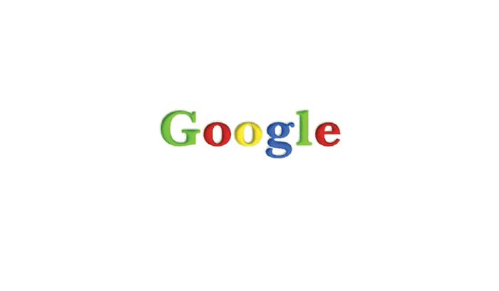
Google’s logo has evolved over the years but not drastically. They have tinkered with it and have made it only more familiar in the process. This signifies the fact that Google believes in what it does and comes out with changes only when it wishes to. Apart from that, the mere tinkering tom-toms the fact that Google doesn’t leave much scope for improvement. They come up with nearly refined products each time.

(Image Courtesy: MyLaw)
So, there you have the significance of colors in Google’s logo. Tell us what you feel about it in the comments below.
(Feature Image Courtesy : Google)
Google's logo is best